Digital Tools & Methodologies Assignment 2: Curated Digital Narrative

My second Digital Tools & Methodologies assignment involved groupwork. We – Jadwiga, Niamh, Senan and Aisha – were required to explore a chosen dataset, interrogate it and, through visualisation, analyse it for a pattern, thus creating a curated digital narrative. We chose to examine the Leaving Certificate results statistics, to be found on the State Examinations Commission website and also here. With the aid of the DIRT Directory, we found several tools which we could use for the data, given its mainly numeric and temporal nature. These included GephiDedooseSylvaRAW Graphs and VIDA. After exploring each of these tools in turn, we opted for the latter two to use in our visualisations: both of them offer a wide range of options for visualising numeric data. For addressing the temporal nature of our data (we wanted to compare several years’ results), we decided to produce an interactive timeline in TimeMapper.

We sought to answer several questions that we asked about the data in relation to the Leaving Cert statistics. The data in spreadsheet format was difficult to interpret and analyse, and we hoped to expose the patterns hidden in it through visualisation and answer the questions that we asked.


In which subject do the most students achieve an A1?

In RAW, we experimented with various visualisations of the percentages of students who achieved A1s in the Leaving Certificate; the answer was rather surprising and reminded us that there is always a narrative surrounding the result. The above visualisation illustrates that Russian is apparently the easiest subject in which to achieve an A1, with 72.1% of those sitting the examination achieving the top grade. Does this mean that Russian is an easy language? It is not a widely-examined subject, with only 333 students – who are mostly native speakers, as Russian is not a school subject – sitting the examination. This leads us to suspect that the Russian examining board may be somewhat lax, as it does not take much pains to implement the well-known bell curve in order to ensure an appropriate standard of difficulty for students.

The visualisation also shows which examining boards are the most vigilant at implementing the bell curve; our suspicions that the more popular subjects would be on this list – such as Irish, English and Mathematics – are proved correct.


Which subjects are boys and girls respectively better at?

The above doughnut charts give us some thought-provoking answers. Unsurprisingly, girls excel at languages and subjects such as Art and Home Economics, and boys do better in mathematical subjects; however, we were surprised to find the almost fifty-fifty balance between the sexes in subjects such as Chemistry, Accounting and Geography.

The above visualisations of subjects typically associated with certain sexes prove these “stereotypes” correct.


Is it true that Higher Level Mathematics is being “dumbed down”? To what extent has the introduction of additional points for Honours Maths influenced numbers of students?

In the first visualisation, produced in VIDA, we can clearly see the sudden jump from just over 800 students taking Mathematics at Higher Level in 2011 to over 1100 doing so in 2012. What could have encouraged such an enthusiasm for Maths? The explanation lies in the circumstance that, from 2012 onwards, 25 additional points have been awarded to those who pass Honours Mathematics, as an incentive for students not to drop to Ordinary Level. This decision led to protests that the Higher Level examination was being simplified in an effort to accommodate the weaker students, who would normally have dropped to Ordinary Level. We decided to investigate whether this objection was valid and produced a visualisation in VIDA to map the proportion of grades from A1 – C1 from 2009 to 2016 achieved. As can be seen, there was definitively a smaller proportion of A1s in 2012 (3.4%) compared to previous years (5.7% in 2011 and 7.5% in 2010) – but, after this drop, it again rises in the next few years, even though the number of students continues to increase. This points us to the conclusion that, in an effort to ensure that grades correlate to the bell curve distribution, the examining board has indeed lowered the level of Higher Maths, thus rendering it easier for weaker students.

GCSE and LC Comparison – Evaluation

Interpreting data sets from both the UK’s GCSE examinations and the Irish Leaving Certificate (LC) examination proved interesting. We decided to compare subjects which are usually core or very common subjects in both examinations, such as Maths, English, German and French.

Taking the GCSE 2016 student performance analysis  for these subjects and the 2016 LC subject results, patterns and similarities between the two could be identified. In RAW, the data from the various spreadsheets was first carefully dissected and then subsequently visualised. For the sake of simplicity, we chose the grade bracket of A1- A2 for LC subjects and A* – A for GCSE subjects.

Unexpectedly, the percentage of students attaining these grades were, for the majority of the subjects, on par. A number of factors had to be taken into consideration when evaluating and interpreting the visualisation. A greater number of students sat some of the GCSE subjects, and a larger number of students allows more room for a variety of both grades and abilities. To put this into perspective, 3657 pupils sat the Higher Level LC English paper while a staggering 513,285 students took the GCSE equivalent. There is a notable difference in the results of the Mathematics exam, in which a far greater percentage of students scored well in the LC exam than the GCSE one. We found this surprising as we were aware of Maths being taught at a higher level in the United Kingdom. This could be due to the fact that LC Mathematics has, as seen from our findings, been “dumbed down”.


Leaving Certificate French and German – Genders

This comparison of French and German results across a number of years unsurprisingly shows that females performed better on all occasions; however, it portrays this information in a fresh and engaging manner. What is notable is that French takes up a much greater amount of space on the diagram due to it being the only foreign language available in many smaller schools.

The following visualisation shows the proportion of females in comparison to the proportion of males who received A1’s in higher level Irish in the 2016 LC:

What is interesting with the languages in particular is that they are not a “gendered subject”, such as Home Economics, which has always had a larger number of female than male candidates. We will now examine a similar situation with another core subject, Mathematics.

Participation by sex in Higher Level Mathematics, 1930 – 2016

In order to map the overall progress in participation for both boys and girls in Higher Level Maths, we used examination results statistics from the Department of Education and Skills website, which contains statistical reports going back to 1924. This line chart once more validates the long-held observation that boys have a greater aptitude for mathematics than girls. Furthermore, a close correlation between the rise of the figures for boys and those for girls sitting the exam is noticeable. This led us to conclude that, with the exception of the post-WWII period, it is hard to say that girls were ever prohibited from taking the subject at Higher Level through discrimination – an assumption that is occasionally made nowadays .

Additionally, it is easy to understand why the 25 extra points for passing Higher Level Maths were introduced in 2012 – the total number of students doing Honours Maths steadily fell after 2001. One is wont to wonder: why? Did the Celtic Tiger make us lazy?
The temporal nature of the dataset we chose prompted us to create a timeline of our visualisations in TimeMapper and add a story to explain the figures. The keywords feature of this tool allowed us to curate our digital narratives according to both time and theme.

The answers to our questions were only part of what we learned. We also gained experience in working with real-world datasets: the spreadsheets of statistics provided by the www.examinations.ie contained vast quantities of data, which could not be entered unprocessed into a visualisation tool. We had to know what statistics we were looking for, often extracting the appropriate figures into a separate spreadsheet. Since Excel spreadsheets could not always be directly imported into the tool, we also became more aware of working with various file formats, such as CSV, TSV and JSON.

Another challenge that we encountered was determining the correct visualisation method for the data we were handling. We learned to stop and consider which ones accurately and truthfully presented the data being handled. We remembered to keep in mind that we were the ones looking for the answers, not inventing them.

Like the visualisation showing Russian as being the “easiest” subject, we gained a better understanding of how statistics and aesthetically-pleasing visualisations can be misleading when one lacks the narrative surrounding it. This narrative is the key to data; but data is also key to a good narrative. The close interconnectedness of the two requires careful handling so as not to distort the objective truth. Digital tools greatly aid us in this task, as they enable us represent multiple aspects (theme, sub-theme, chronology) of the narrative in a single interactive visualisation.

Links:

http://www.examinations.ie/

http://www.education.ie/en/Publications/Statistics/Statistical-Reports/

https://dirtdirectory.org/

https://gephi.org/

http://www.dedoose.com/

http://sylvadb.com/

http://rawgraphs.io/

https://vida.io/

https://d3js.org/

http://timemapper.okfnlabs.org/

http://www.bstubbs.co.uk/gcse.htm

http://www.education.ie/en/Publications/Statistics/Statistical-Reports/
Digital Artefact- The power and purpose of hastags

For my digital artefact Niamh and I decided to work together to create an artefact. At first we were a bit unsure on what we wanted to base our artefact on. I brainstormed on a lot of ideas over Christmas between programming a website, a game and doing a YouTube video. We then decided we wanted to video ourselves and post it on YouTube as part of our digital artefact. Niamh then came up with the idea that we would do a video on the power of hashtags. I thought it was a brilliant idea because of how much hastags have taken social media by storm. At first they were just a tool for collecting tweets on certain topics on twitter but now with the use of this small symbol a person’s voice can turn into a massive wave of voices across the whole world within minutes.

Niamh and I then started researching different hastags that took social media by storm such as the #MarriageEqaility, #PrayforParis, #RefugeesWelcome, #BlackLivesMatter and #PrayforOlanado. These were just a few of the powerful and influential hastags movements we found. We also found different hashtag movements that went viral for no apparently reason mostly because of a lot of people found it funny such as the #DamnDaniel which was retweeted by millions of people on instagram within hours or the #MannequinChallenge which thousands of people participate in even very well known celebrities.

After we both felt like we had enough information to make our video we met up and talked about what we both wanted to put into the video. Using white A4 sheets we wrote in big writing all the hashtags we wanted to put into the video and used cue cards to write even more information to elaborate on the hashtags. Using Niamh’s iPhone we recorded the introduction to the video explaining what this video was going to be about. We then each took turns recording each other holding up different hashtags and then explaining how they become so popular.

We also wanted to put in some humour into the video so we recorded ourselves doing the Mannequin Challenge with the help of Niamh friend.  We also did an imitation of the damndaniel video which was took a couple tries to get right. We did all of this in individual shots of a couple seconds instead of making one long video because it would be easier to edit it all together in case we made any mistakes.

When we were satisfied with each individual clip with then recorded the conclusion were we just talked about everything we said throughout the video. When everything was finished we then logged into Niamh’s youtube channel and began editing the video. Editing the video was probably the most challenging part because neither of us had ever made a youtube video or edited a video so it took us a bit to familiarise with the youtube editing system but once we got the hand of it, it was very easily. Editing the video took maybe an hour as we had to combine all the clips together, add music, and edit out all the bloopers and add some text.

We then uploaded the video to youtube and as soon we it was done processing we shared the video on twitter.

Bibliography

Wikipedia, ‘Hashtags’ https://en.wikipedia.org/wiki/Hashtag (Accessed 7th of January 2017)

Wikipedia, ‘Hashtag Activism’ https://en.wikipedia.org/wiki/Hashtag_activism (accessed 7th of Janurary 2017

The Washington Post/ Tanya Sichynsky. 2016. These 10 Twitter hashtags changed the way we talk about social issues. [ONLINE] Available at: https://www.washingtonpost.com/news/the-switch/wp/2016/03/21/these-are-the-10-most-influential-hashtags-in-honor-of-twitters-birthday/?utm_term=.59681db787c6. [Accessed 9 January 2017].

Zooniverse.org

downloade


WHAT IS IT?

Zooniverse is an online site which allows users from all around the world to contribute data to major research. As more and more data starts to accumulate users are able to form their own conclusions from it and this is used by actual scientists and researchers for investigations. Those that visit the Zooiverse site on a daily basis are not typically scientists and a lot don’t even have even interest in science but just want to contribute to the understanding of the universe.

PROCESS

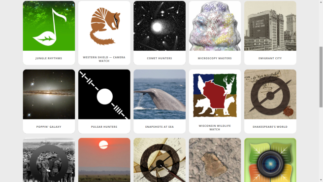
Upon reading about this assignment I had never heard of Zooiverse but that was the same for last year’s project on Open Street Map and I thoroughly enjoyed that experience so I went into this with an open mind. When browsing through the site the first thing I noticed was that everything was laid out clearly and it was easy to read. The one thing I was apprehensive about Zooiverse was that there would be too much information to take in at once and it would take me a while to understand it however that was not the case. Everything was laid out simply with only 6 heading at the top of the page to take you into the different sections for the site. Before registering the first thing I always do on a site I’m unfamiliar with is read the ‘about us’ section. This gave me great insight into what Zooniverse was all about and I surprised to find out that Zooniverse is the “world’s largest and most popular platform for people-powered research”. After I had registered to the site and picked my own personalized username and I clicked on ‘projects’ I was guided into the different projects the site had to offer. When browsing through there were so many categories that caught my eye such as nature, history, physics, and literature. Keeping in mind of my minor subject religion I tried to find any religion disciplines however there was none so I tried to choose another projects that were somehow related to religion so I choose history to start on.

Zooniverse-1 (1).png

There were about 9 projects relating to history and each project were very different from the other so I had a lot of choose from. Anything war related has always interested me so I immediately went with the project titled ‘Measuring the Anzacs’. In this project you had to transcribe “first-hand accounts of New Zealanders from the Australian and New Zealand Army Corps circa World War I”. You are then given the choice to either mark the documents or transcribe them. Making involving singling out specific pieces of data in the document for example: nationalities, age, dates, occupation and heights, etc. Transcribing involves typing in information that you and other volunteers have marked. I choose marking and was asked simple questions such as what kind of documents was it and a list of options to choose from. You are then asked to label and draw a rectangle around the list of corresponding entries on the document provided such as surname, unit, occupation, and date etc. Even though each document was clearly handwritten I found them quite easy to decipher however some of the letters were written quite small or in cursive so I had to read over it a couple to time to understand what was being said.

A lot of the pages had already been marked or transcribed by other volunteers so that was really interesting to see.

After I finished on that project I went into a different project titled ‘Shakespeare World’. Here you had to transcribe real hand written documents from Shakespeare’s contemporaries. Unlike World War I document these were not written in English at all. Although very neat I couldn’t decipher a single word. Even attempting of match up illustrations or symbols was difficult because everything more or less looked the same to me. Even with those obstacle I still attempted to decipher the words, there was even a zoom in bottom there which helped a great when comparing different symbols.

zooniversess3

Intrigued by the way all the documents were handwritten I decided to further research on Shakespeare writing style as I remembered hearing somewhere that he had used a unusual approach.  Unusual was right I learned that Shakespeare had written all this plays and poetry in iambic pentameter which means ten syllables to a line and all these lines were unrhymed.

What most impressed me when marking and transcribing these documents was that you are not expected to transcribe the whole thing. You are still able to move on even if you were only able to make out a quarter of the page. There is even an option to click on explaining you didn’t transcribe the whole page which I found extremely clever of the owners of Zooniverse because only allowing full transcription of documents and diaries would present less volunteers. Contributing to ‘Measuring the Anzacs’ and ‘Shakespeare World’ gave me the advantage of experiencing the process of digitalised data in a way I had yet to experience.

Although I found my experience on Zooniverse enjoyable I did notice some issues. For instance some of the images and documents are so blurry to a point that they are completely illegible. In a lot of the images the lightening in it was sometimes far too dark or far too light because of this I found myself just skipping through the images as they were not at all engaging. If we aren’t able to clearly make out some of the images how do researchers and scientists expect responses from volunteers. Upon first scanning through the projects available I initially thought that were a lot of choice but after playing around with the site I realised there actually isn’t. I see great potential in this site and the only real thing lacking is its lack of categories such as religion, film, economics, languages and more .Zooniverse has the potential of growing even more but the developer’s just need to work on those issues.

So what is the purpose of Zooniverse? It enabled me to understand the benefits of crowd sourcing and digitalised data. The projects I worked on may be small but hopefully was somewhat helpful to somebody. Although the projects I partook with weren’t related to my minor subject I feel like I was somewhere contributing to history and that felt very good. I feel confident that the tools used on Zooniverse for data obtaining will have benefit for my studies in the future.


Bibliography

https://www.zooniverse.org/

https://www.shakespearesworld.org/#!/


Open Access Martyr?- Remebering Aaron Swartz

tobsas_poster

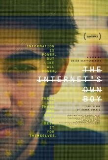
Trying to pick a specific subject that stood out for me in Doona’s class last semester was way harder than I thought it would be because throughout her class the subjects that we discussed as a class were always so interesting to me, but I managed to pick one that moved me the most and that I still think about from time which is ‘The Internets Own Boy: The Story of Aaron Swartz’

This powerful and gripping documentary follows the story of programming prodigy Aaron Swartz who committed suicide at the young age of 26 after being aggressively pursued by the US government for obtaining academic journals illegally from the servers at the Massachusetts Institute of Technology.

“ We need to take information, wherever it is stored, make our copies and share them with the world”-Aaron Swartz Guerilla Open Access Manifesto

Swartz wanted a world where information for free for all and not stored behind huge paywalls only available for those who were willing to pay. This ensued Aaron’s groundbreaking fight for social justice and open access which ultimately landed him in a two year legal battle. It was this battle that ended in him taking his life. This movie serves as a documentary of Aaron’s life. Aaron is portrayed as a young and brilliant computer expert who refuses to give up on the obey the ‘unjust laws’ of the government. Director Brian Knappenberger did an amazing job in making the film and documentary Aaron’s life

Aaron’s battle not only touched a nerve with me but also with millions of online communities all over the world. Aaron Swartz certainly left this world too early but his fingerprints are still all over the internet and his legacy will be remembered for a very long time.

Bibliography

The Internet’s Own Boy: The Story Of Aaron Swartz(2014)

Aaron Swartz(2008)” Guerilla Open Access Manifesto” https://archive.org/stream/GuerillaOpenAccessManifesto/Goamjuly2008_djvu.txt


TED TALK REVIEW: YOUR BODY LANAGUAGE SHAPES WHO YOU ARE?- AMY CUDDY

cuddy tedglobal.jpg


“We make sweeping judgements and inferences from body language”- Amy Cuddy

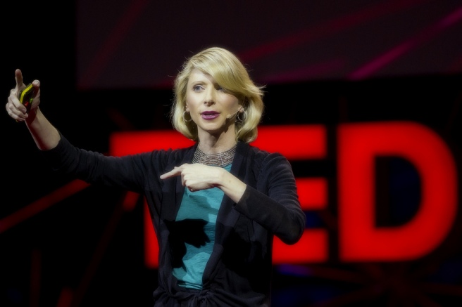
Amy Cuddy gives a humorous and engaging talk on body language and its connection to your own personality.

Harvard social psychologist Amy cuddy shares her evidence on how ‘power poses’ and our stances not only effect how people around perceive us but how we perceive ourselves. Amy Cuddy makes a very interesting case on how our society is obsessed with body language. We analyse body language through all aspects of day to day life such as in the work place, in politics and in the media. We instantly make judgements of others through their body language, expressions and gestures. I found myself nodding in agreement to a lot of the points Cuddy was making.

Every since watching Ken Robinsons ted talk on ‘Do School Kills Creativity’ I’ve become a huge fan of ted talks and the issue for me now is which one to pick. I was randomly scrolling through YouTube and stumbled upon this ted talk and I’m very happy I did because this has easily become one of my favourite ted talks. This Ted talk have been viewed on YouTube nearly 12 million times and its definitely up there with the top 10 most popular ted talks of all time so if you’re a Ted fan this is a good one to watch. Cuddy had me laughing within the first 10 seconds of the talk which made me want to keep watching. Her humour throughout the video worked perfectly and was always well timed.

‘You want to feel that you have the power to bring your full, spirited self to the situation, stripped of the fears and inhibitions that might typically hold you back- Amy Cuddy.

It is important to look confident, uncross your legs and arms and sit up straight. It is how we show your confidence to other people. According to Cuddy this change is not only psychological but hormonal. Testosterone and cortical levels in our brain can even affect our chances of success.

Cuddy also stated that you should ‘fake it until you become it’  and  what she meant by that is if in your head you think you can and your always trying to convince yourself you can eventually it will happen. This I feel has taught me how to change my life to a certain point where I can feel more confident. By just doing different body postures and gestures I can increase testosterone in my body and decrease cortical. Even if I feel slightly ‘fake’ doing it like Cuddy said, keeping faking it until you ‘become it.

I myself have a huge fear of public speaking and I think if I can fake the confidence and knowledge it can become a useful strategy in permanently changing my everyday life and the way I do things.


What I particularly like about this talk is that Cuddy draws from her own life experiences and trauma to illustrate her talk, giving us a very riveting talk. Changes like these no matter how small they are can have a huge impact on your life “the people who can use it the most are the ones with no resources and no technology and no status and no power. Give it to them because they can do it privately. They need their bodies, privacy and two minutes, and it can significantly change the outcomes of their life”-Amy Cuddy

bibliography


Open street map- my thoughts

Openstreetmap_logo.svg

I first got introduced to open street map in my digital tools and methodologies module. Initially the idea of mapping streets and buildings didn’t seem like something that would interest me very much but as the concept  got explained to me more and I got to actually map my own neighbourhood I started to enjoy myself to my own surprise.

Open Street Map was first founded by Steve Coast in July 2004. Coast was inspired by the Wikipedia model and its sheer lack of location and map data to users in the United Kingdom. What’s so great about Open Street Map is that its free data that’s available to manipulate. It comes under the Open Database License making all mapping data available to anybody with no limitations or restrictions. There are people from all over the world mapping new streets, buildings, car parks and even shipping lanes every day.

Process

Out of the two tasks I could choose from for this assignment I decided to map my own local neighbourhood on Open Street Map which is Killarney, Co. Kerry. I decided to map my own neighbourhood because the streets and names of the buildings were more familiar to me than a random town in Cork. The process to joining Open Street Map was very easy and fast. Within five minutes I had typed in my email address, picked a username and password and was ready to start mapping. Open Street Map has a search engine which allows you to find any town or city around the world to map. I picked my own town Killarney. Surprisingly I found that that a lot of Killarney had already been mapped with a few exceptions. Although a lot of the streets and buildings in Killarney had already been map I found that some of the names of the buildings had been left out so I went about writing the names of these buildings. Also other users had mapped shops that had closed down so I went about changing it to its new names and putting in shops and building that had recently opened in Killarney.

The implications of what I contributed are that now there is more mapping information available for users who want to search the town of Killarney. It provides up to date local knowledge of all the wide range of streets in the town new shops and buildings there and all those that have recently opened. Open Street Map describes itself as an open source so anybody can use the map information contained in Open Street Map meaning those new to the town of Killarney can use that information to familiarise themselves with the town.

One of the most important things I learnt from my experience of mapping on this site is that to my surprise there is an ever growing community of mappers around the world. To my surprise I found that Lagos, Nigeria a city where I was born had also been mapped by people. I also learnt that information and data is always changing so there will be no shortage of places to map which I believe in my opinion is good.

In conclusion I am very impressed with Open Street Map and its detailed and accurate maps. It has no limitations so each map is unique and can be rendered in different ways. Although Open Street Map is not perfect similar to most maps but it has potential and I believe it will continue to thrive in its ever growing community.


Bibliography

https://www.openstreetmap.org/

Digital tool review: wordpress

download

After spending some time researching fascinating tools on DiRT Directory( Digital Research Tools) I decided to do my review on WordPress. As part of my digital humanities course we were asked to set on a blog and for my blog domain I decided to use WordPress as it seemed easy to use and it was free.

History of wordpress

“WordPress is a free and open-source content management system (CMS) based on PHP and MySQL”- Wikipedia. WordPress was first released in May 27, 2003 by its creators Matt Mullenwag and Mark Little as a fork of b2/cafelog. WordPress was well received by communities all over the world.

why use wordpress?

WordPress is a free online software which allows you to download, install and modify your blog or website. It’s an open source which allows one to create any type of website to the users choosing; it also means there are millions of people around the world working on it every day. As an open source WordPress allows people to contribute such as answering questions, creating your own themes and writing your own plug-ins. When you choose WordPress you have complete and utter control of your website without any restrictions or limitations. WordPress might have started out as blogging systems in the past but it has evolved to much more today. While you are of course still able to use WordPress to create your own personal blog, it now allows you manage a whole website and mobile applications.

Its easy to set up and manage

Wordpess is used by millions of people every single day. In fact WordPress was used by 23.3% of the top 10 million as of January 2015. It’s the most popular blogging platform on the web with over 75 million websites. You don’t need to be a web designer or an internet expert to understand and use WordPress. In fact like me you don’t need to have any prior knowledge of designing website all you need really is internet connection. WordPress is the perfect starting point for a small business. You are able to customize your website to your liking and then watch it grow before your eyes.

Designed themes and plug-ins

Personally I think one of the greatest features of WordPress is its themes and plug-ins. WordPress allows you to choose a theme most of them free without having to pay for a website designer. Themes can make your website look completely different with just a click of a button. There are 3 basic types of WordPress themes.

  1. Premium
  2. Custom
  3. Free


 Free WordPress themes and plug-ins

Currently on WordPress there are over 2600 themes and 31,000 plug ins. You are able to install them onto any website. There are themes available for every kind of website. Whether you want a food theme, photography theme, business theme, pink theme or e commerce theme there are plenty available. One of the downsides however to the vast amounts of themes is that not all of them are top notch, so if you want the good ones you may have to pay a small fee. Themes on WordPress are very easy to customise as they come with an options panel allowing you to change the font size, background colour and widgets. Plug-ins also adds additional functionality onto your website.

WordPress supports different media types

WordPress is not only limited to just writing text it allows you to add images, video and audio files in order to enhance the appearance of your website or blog. For example you are able to embed YouTube videos, Tweets, Instagram posts and photos and even Sound cloud videos in your posts. Everything is very flexible on WordPress.

WordPress is safe and secure

Since WordPress has such a big community supporting it, it is therefore not surprising that of course it’s a target for hackers. However WordPress takes it security very seriously and constantly updates its systems to prevent these attacks.  New versions of WordPress are set out regularly which contain new features and of course security updates. There are even tutorials on the WordPress website that show you ways of keeping your website safe and secure from these hacks.

In conclusion I have found my experience on WordPress to be a very enjoyable one. At first the website and the concept of writing a personal blog seemed very daunting but as I used it more and more and became familiar with all its features I started to looking forward to checking my blog and writing more posts. I would recommend WordPress to anybody wanting to start off with a simple personal blog or website as it’s a good medium.


Bibliography

https://en.wikipedia.org/wiki/WordPress

http://dirtdirectory.org/


SOICAL MEDIA IN SOCIETY: THE GOOD, THE BAD AND THE UGLY

iStock_000027555541_Small-1260x840

“Social media is addictive precisely because it gives us something which the real world lacks: it gives us intimacy, direction, a sense of clarity and value as an individual”- David Amberland, The Social Mind, 2012

Do we live in a world where people don’t communicate with each other in person and it’s now all done through social media? Back in the day in order to talk to somebody who doesn’t live close to you, you’d have to send a letter, call them or make the effort to actually visit them. In today’s society this can all be done with a click of a button. Whether the person lives 5000 miles away or just down the road communication through social media is expanding more and more each passing day.

“ We don’t have a choice on whether we do social media, the question is how well we do it”- Erik Qualman

There are of course huge advantages to social media one being the effect it has on socialization. Social networking sites such as Facebook, Instagram, Twitter and Snapchat allow users to connect and reconnect with people such as family and friends who don’t live close by.  It allows you to keep up with what’s going on in their lives without having to fork out money for an expensive plane ticket or long distance calls. People also use social media to keep informed of the latest global developments and campaigns and voice their opinions on these issues. For example the terror attack on Paris received huge attention on social media. Within minutes there was an unprecedented expression of love and sorrow on all platforms of social media all over the world. Eyewitnesses were able to log onto their social media and warn people of these attacks. Every single image, word and video was being posted on sites such as Facebook, Twitter and Instagram. Social media is changing the way people learn of these attacks and how they react to them.

“The dark side of social media is that within seconds, anything can be blown out of proportion and taken out of context, and it’s very difficult not to get swept up in it all”.- Nicola Formichetti

Unfortunately there are of course negative effect of the use of social media, the obvious one being cyber bulling. Cyber bulling on social media can happen to anybody at anytime. Users are able to publish malicious comments on social networks without being identified. This type of behaviour can lead to depression and in some cases suicide.

In conclusion there are many positive and negative effects of social media.  It can be used to bring people close together or tear them apart. Instead of using social media to spread nasty comments about each other it should be used as a platform for good instead of bad. A lot of things can go wrong online, but a lot of things can go right as well. It all just depends on how we decide to use it.


Bibliography

https://www.goodreads.com/quotes/list/3512499-david-amerland

http://www.brainyquote.com/quotes/keywords/social_media.html

https://www.goodreads.com/author/quotes/2929393.Erik_Qualman


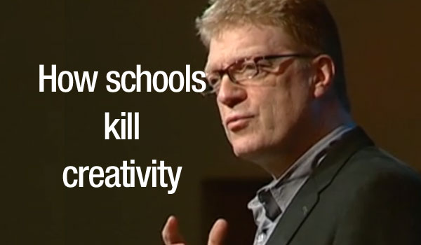
TED TALK REVIEW: DO SCHOOL KILL CREATIVITY?- SIR KEN ROBINSON

how-schools-kill-creativity

“We are educating people out of creativity”- Sir Ken Robinson

Sir Ken Robinson gives a humorous and profoundly moving talk on education and its connection with creativity.

Internationally recognised speaker and advisor on education Sir Ken Robinson challenges our ideas on how we educate children in today’s society. Ken Robinson makes a very interesting case that the educational system should be somewhat encouraging creativity instead of ridiculing it. I found myself nodding in agreement to all of the points that he was making.

If you haven’t already guessed I thoroughly enjoyed Robinson’s talk and think he did an amazing job presenting the subject of creativity. What I particularly liked about Ken Robinson and his talk was that it didn’t feel like a presentation more of a personal conservation with the audience. He also did not read of notes or use a power point slides which shows he is very passionate about what he is talking about. Even more importantly in my opinion he used humour which worked wonderfully and was well timed. This gave the audience a break from the seriousness of the subject and allowed them time to prepare for the next serious part of his presentation. One of my favourite parts of the talk was early one when he made a very interesting and important point and the crowd applaud and he paused and said “That was it by the way. Thank you very much. So fifteen minutes left”.  He uses this type of humour throughout his speech very clearly as it lightens the mood which I think is very important.

“Creativity is as important now as literacy. We should treat it with the same status”- Ken Robinson.

This is a bold and true statement Robinson makes at the beginning of this talk which impacted me greatly. I think people need to understand that he’s not saying that creativity is way more important than literacy, the ability to read and write because without those attributes you would not get anywhere in the world but that creativity should be equalled to it. He also makes a very important point that in today’s society children are being awarded for their academic talents but not enough for their creative talents such as music, dance and art. He says that “every educational system on Earth has the same hierarchy of subjects, at the top are mathematics and languages, then the humanities, and the bottom are the arts. I completely agree with that point he made. They are being starred away from subject like those and pushed in the direction of the subjects of maths, sciences and health cause apparently your more likely to get a good job with degrees in those than ones in art and music. “Thing you were good at, at school wasn’t valued or was stigmatised” Ken Robinson. Society is becoming a “process of academic inflation” which a basic bachelor degree is being worth less than ever before. Now in order to be in the running for a job that before would have only needed a bachelor’s degree you now hhave to have done a masters or even a PHD which I believe is not fair at all.

Robinson then ends his talk with his desire to incorporate more creativity in the educational system as he believes it is just as important. He sees children as a vital part of the world future and in order for people to start accepting creativity as something important is by “seeing our creativity capacities for the richness they are and seeing our children for the hope that they are”.- Ken Robinson


Bibliography


A critical response to “Storytelling”

story_1

“People think stories are shaped by people. In fact, it’s the other way around”-Terry Pratchett, Witches Abroad, 1991

As part of the continuous assessment in my course I had to tweet a twessay to the #storytelling  <blockquote class=”twitter-tweet” lang=”en”><p lang=”en” dir=”ltr”>Storytelling is evolving. Write an essay about this issue in 140 characters using <a href=”https://twitter.com/hashtag/DHUCCtwessay?src=hash”>#DHUCCtwessay</a&gt;. Innovate, narrate. Don't waste a character.</p>&mdash; Donna M. Alexander (@americasstudies) <a href=”https://twitter.com/americasstudies/status/665120041894060032″>November 13, 2015</a></blockquote>

//platform.twitter.com/widgets.js

When I first saw the title for our next twessay I was a bit unsure on what to write and how to narrow it all down to 140 characters. There were a great deal of ideas and thoughts flowing through my mind and in the end I came up with this tweet in response<blockquote class=”twitter-tweet” lang=”en”><p lang=”en” dir=”ltr”>storytelling is evolving the way we think and our accessibility to new technology <a href=”https://twitter.com/hashtag/DHUCCTwessay?src=hash”>#DHUCCTwessay</a></p>&mdash; aisha yekini (@aishay123) <a href=”https://twitter.com/aishay123/status/667516601231663105″>November 20, 2015</a></blockquote>

//platform.twitter.com/widgets.js

Today storytelling is an essential part of our society and culture. Movies, paintings, religion, social media, news media and music, you name it are all in a form of storytelling and can seen in nearly all aspects of daily life nowadays. The evolution of storytelling is quiet old. Nobody can really pinpoint when the very first story was told. Did it occur in a dark gloomy cave with handprints used as words by hunters? We may never know, but the first evidence of any type of storytelling was found as long as 25,000-30,000 years BC, humans were painting handwriting on caves to tell stories. From painting in caves to big blockbuster movies, although the methods of storytelling have changed, the desire to hear and tell the stories by other people has not. “The greatest art in the world is the art of storytelling” Cecil B. DeMille

Throughout the years the evolution of new technology has allowed people to make use of storytelling. Due to the advancement of technologies such as the internet, film, social media and the printing press the way we tell stories and keep other people up to date on current issues has made storytelling much more enticing.

“I don’t believe for one second that digital imaging or digital technology will ever take away the humanity of storytelling because storytelling in and of itself  is a wholly human concern- David Fincher, Side by Side, 2012

I really liked what one of my classmates @Deebrady_dh had to say as her response to storytelling <blockquote class=”twitter-tweet” lang=”en”><p lang=”en” dir=”ltr”>Storytelling is evolvin&amp;changin wit culture&amp;technology.Stories which wud otherwise b lost r being digitalised 4Future gens 2 c <a href=”https://twitter.com/hashtag/DHUCCtwessay?src=hash”>#DHUCCtwessay</a></p>&mdash; Deirdre Brady (@deebrady_dh) <a href=”https://twitter.com/deebrady_dh/status/667153170758565888″>November 19, 2015</a></blockquote>

//platform.twitter.com/widgets.js

This is incredibly true as storytelling is always changing and it never stays the same. This change massively changed our society and culture and without this change all types of stories would be lost and never told to future generations down the line. Deirdre’s tweet I think resonates with mine, as we are both saying that the changing of technology is changing the way stories are being told.

In conclusion I believe that the art of storytelling will always be an important part of people lives and it will continue to evolve along with the development and accessibility to new technology.


Bibliography

https://twitter.com/deebrady_dh?lang=en

https://www.goodreads.com/quotes/309482-people-think-that-stories-are-shaped-by-people-in-fact

http://www.wired.com/2012/04/side-by-side/